Behind the Scenes: Inside the Home of our Fall '22 Catalog

A few months back, the Schoolhouse Photo Team ventured to a historic 1910s home to capture our Fall ‘22 Collection. To paint a picture: imagine stacks of boxes, the bustle of bubble wrap, and lots of laughter. In many ways, Schoolhouse sets encompass all the best parts of camp: the joy, the teamwork, the memories (of photoshoot’s past), and the overall sense of camaraderie when it’s all over.
We always walk away inspired by the magic of the moment and how it all comes together on camera. So, this week, we wanted to share a slice of what goes on behind the scenes. Scroll below for some clips from our fall shoot and a few takeaways on how to style a space for the seasonal shift.

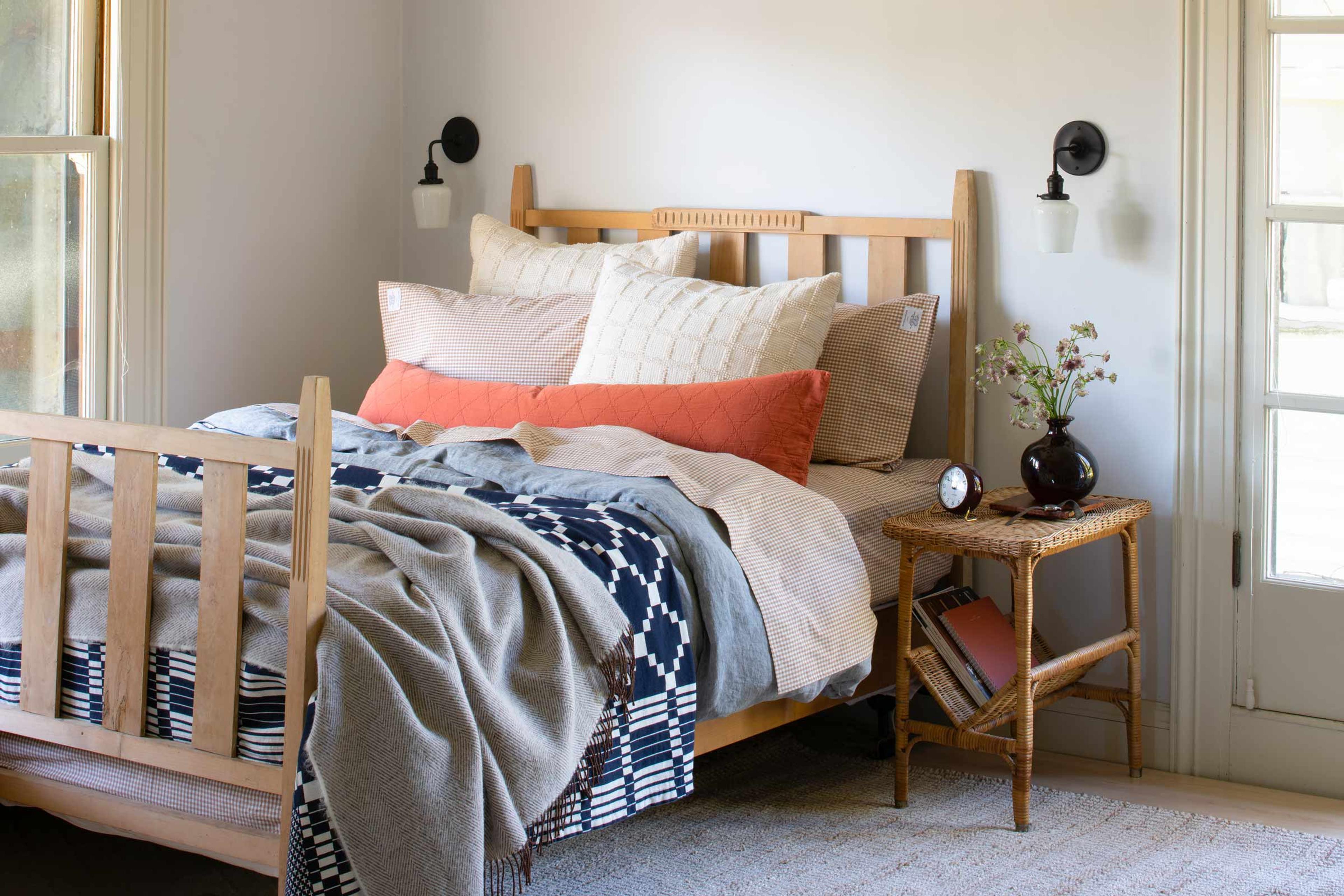
Introducing new bedding is a great way to freshen up a space. For fall, we were drawn to mixing and matching patterns with warm, earthy tones. Our stylist on set started by picking a blanket as a focal point. She then layered in neutral sheets and added a pop of color with a quilted pillow (there's no need to make a mountain. Usually, one or two pillows are perfect).

Playing with color is the perfect way to refresh a room and set a mood. For the bathroom, we wanted to introduce tones that would play off of the walnut wood of the mirror and the dark colors of fall greenery. We gathered images that represented the warm glow of autumn and built the bathroom vignette around our palette.

Introducing new art to a space can feel daunting at first, especially when you've been settled into your home for a while. For our fall photoshoot, we got creative by pulling in new pieces without overhauling the entire living + dining room layout.
We knew the moody backdrop in the dining area brought out the colors in the art prints, but we did not want to shift the homeowner's furniture around too much, so we decided to create an art nook in an empty corner of the room. We brought in a caned chair for warmth, the Mesa Rug for texture, and the Joe Floor Lamp for an eclectic edge that contrasted the formality of the crown molding.

Throw blankets and pillows offer an easy opportunity to add visual variety to a living, dining, or bedroom. It's simplest to start with a neutral palette. In the sitting room above, we worked with a base of creams, whites, and grays. Knowing we wanted to style on the bolder side, we added a few colorful pillows in the mix. The brightness of the blue and the warmth of the terra cotta tones play nicely together, and both pillows offer enticing texture that help layer in visual interest.

A good workspace offers multiple layers of lighting. Daylight serves as the primary source for the space, while overhead lighting steps in when the days get shorter. In the office, we brought in the Studio Desk Lamp to provide directional lighting and the Ion Lamp as an accent light to highlight the clock and a handful of personal items.
When styling, it's best to arrange objects throughout the space to let the eyes travel. Here, the playful green of the lamp ties in with the fern, while the painted and natural woods help warm up the space.


