Inside the Collaboration: Schoolhouse x Anisa Makhoul
By
Published On
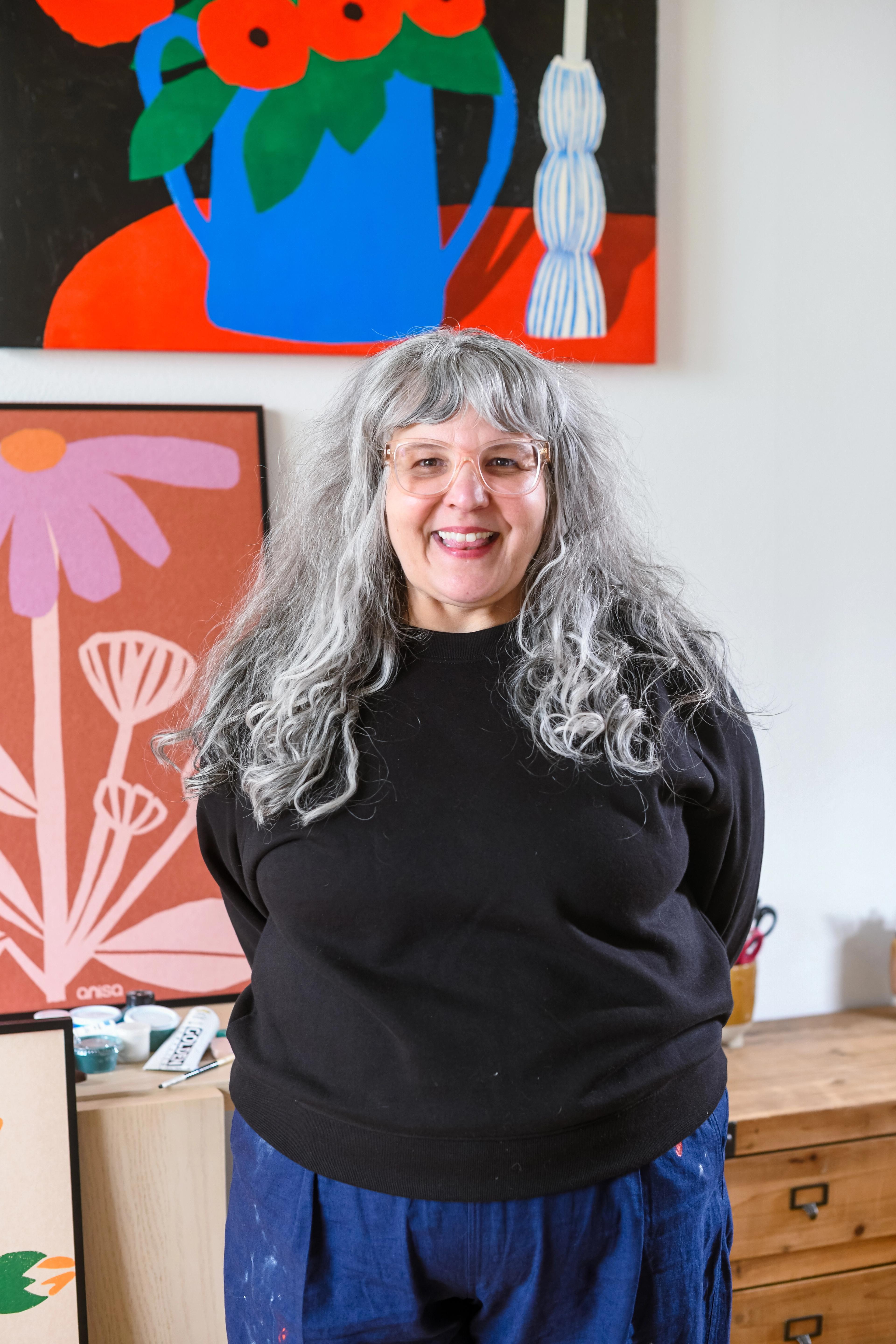
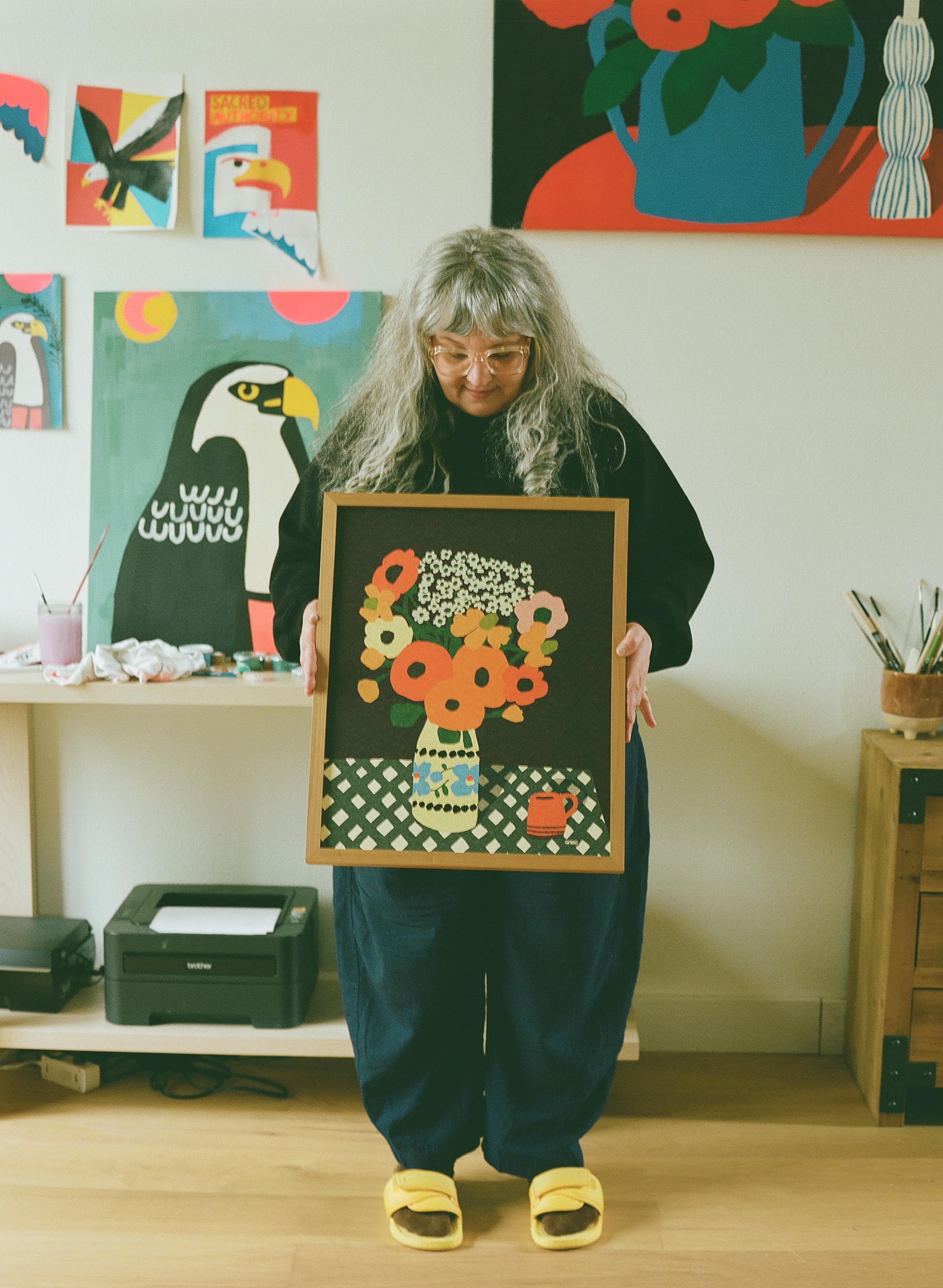
For artist and illustrator Anisa Makhoul, creativity has always been a guiding force. From studying Printmaking and Media Arts in college to running a clothing company, art has been a constant thread throughout her life. But it wasn’t until her son arrived, and they began drawing together at the kitchen table, that her true calling in illustration emerged. After taking a few online courses, she quickly found herself immersed in the world of editorial work and fabric design, discovering in her 40s that she had finally found the path she was meant to walk.
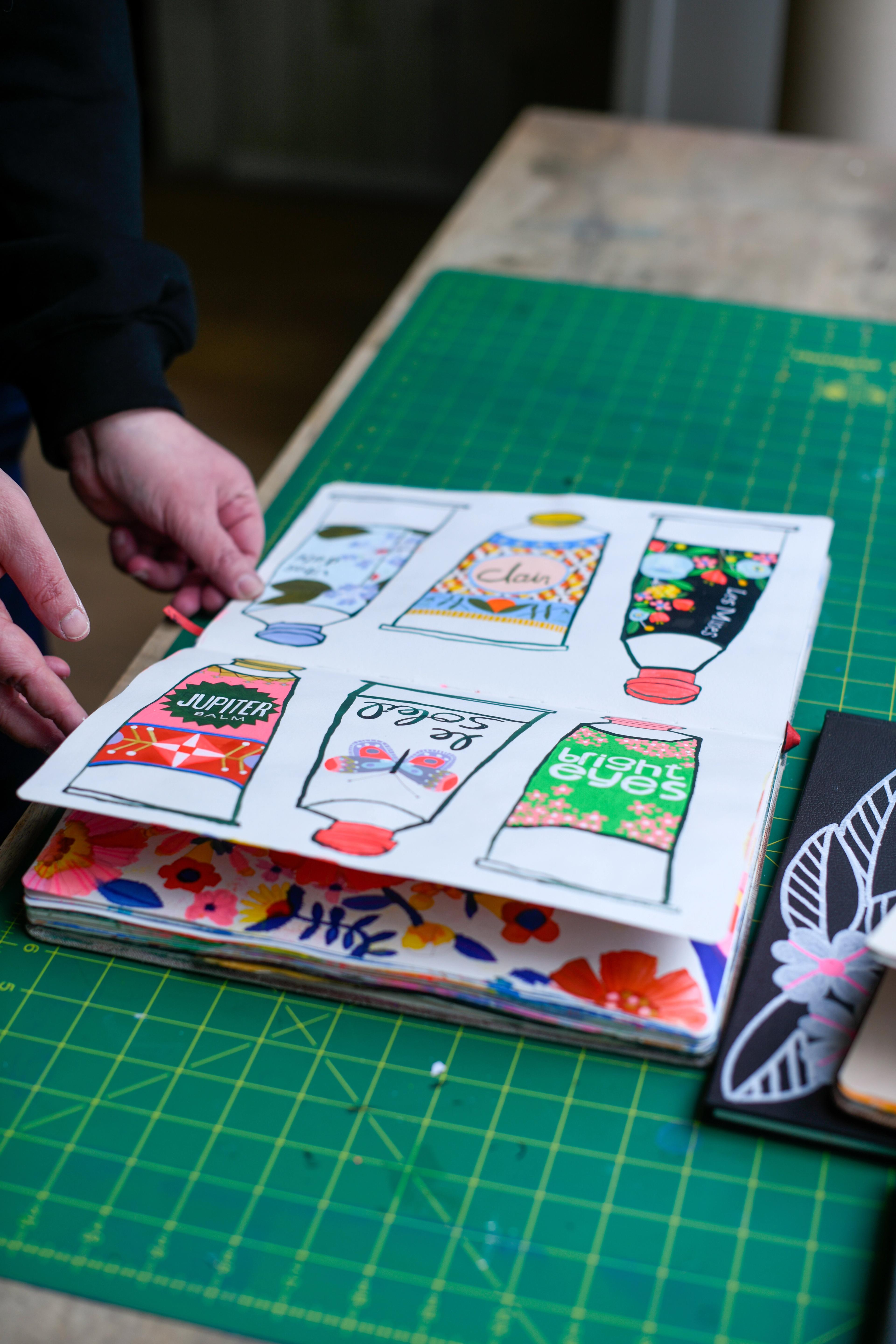
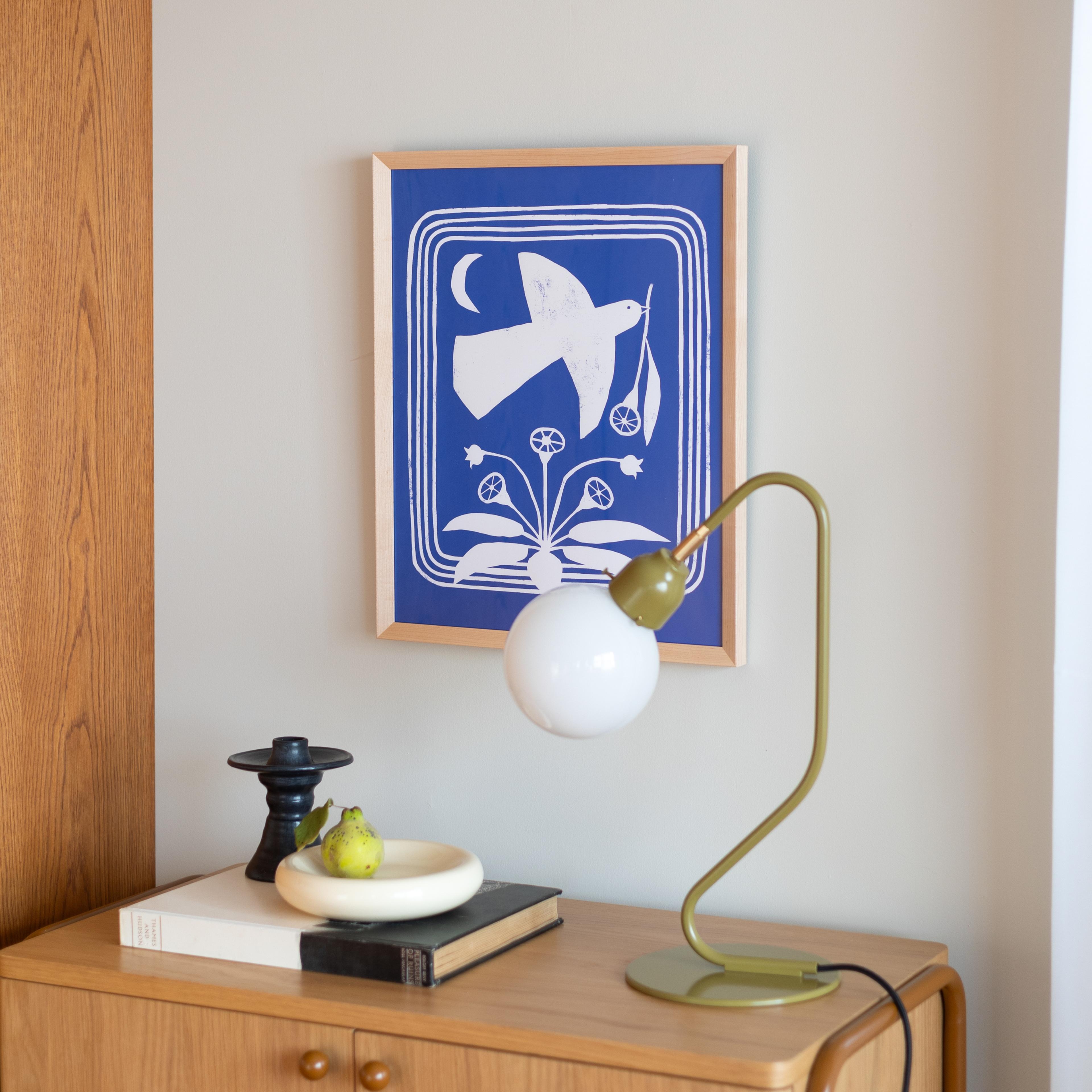
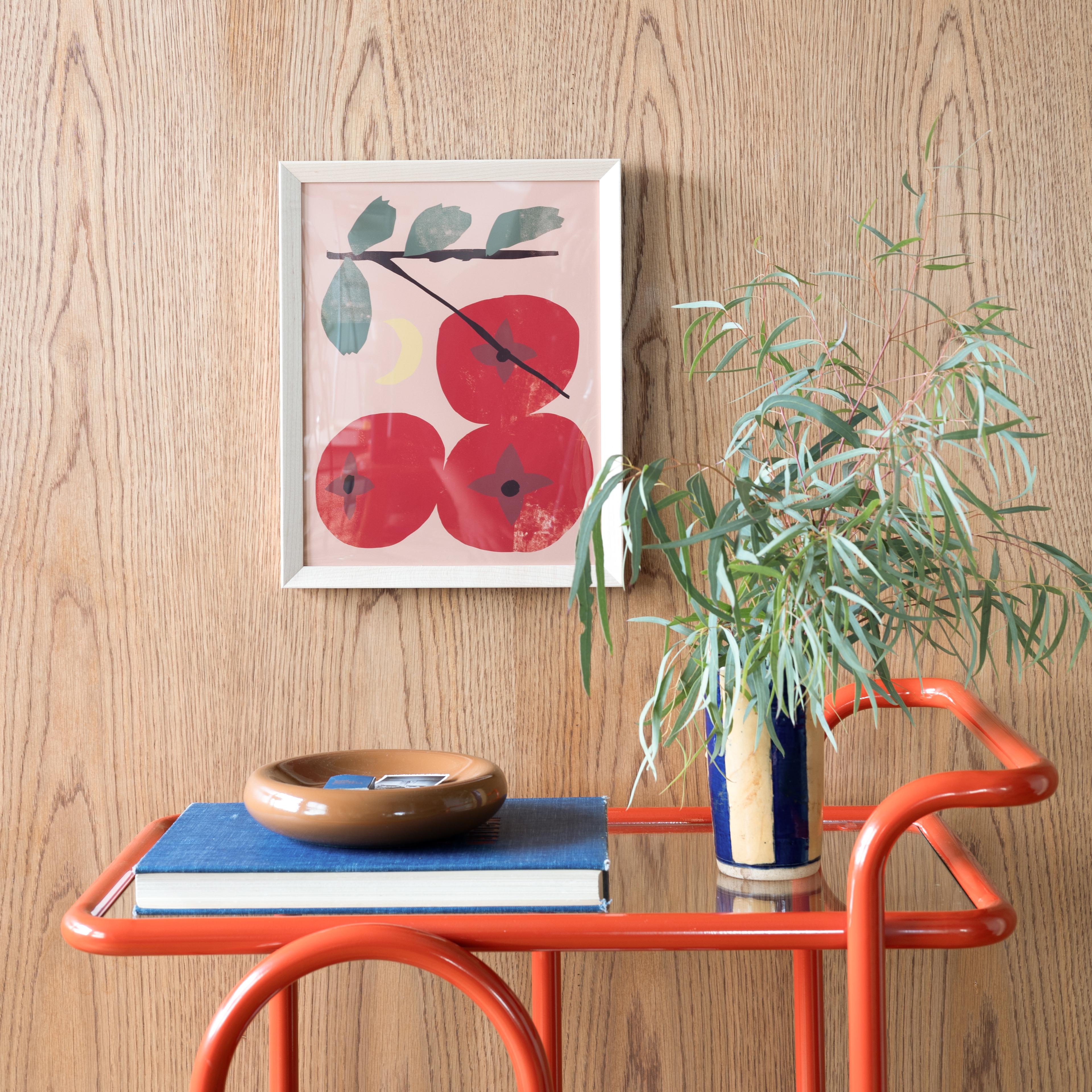
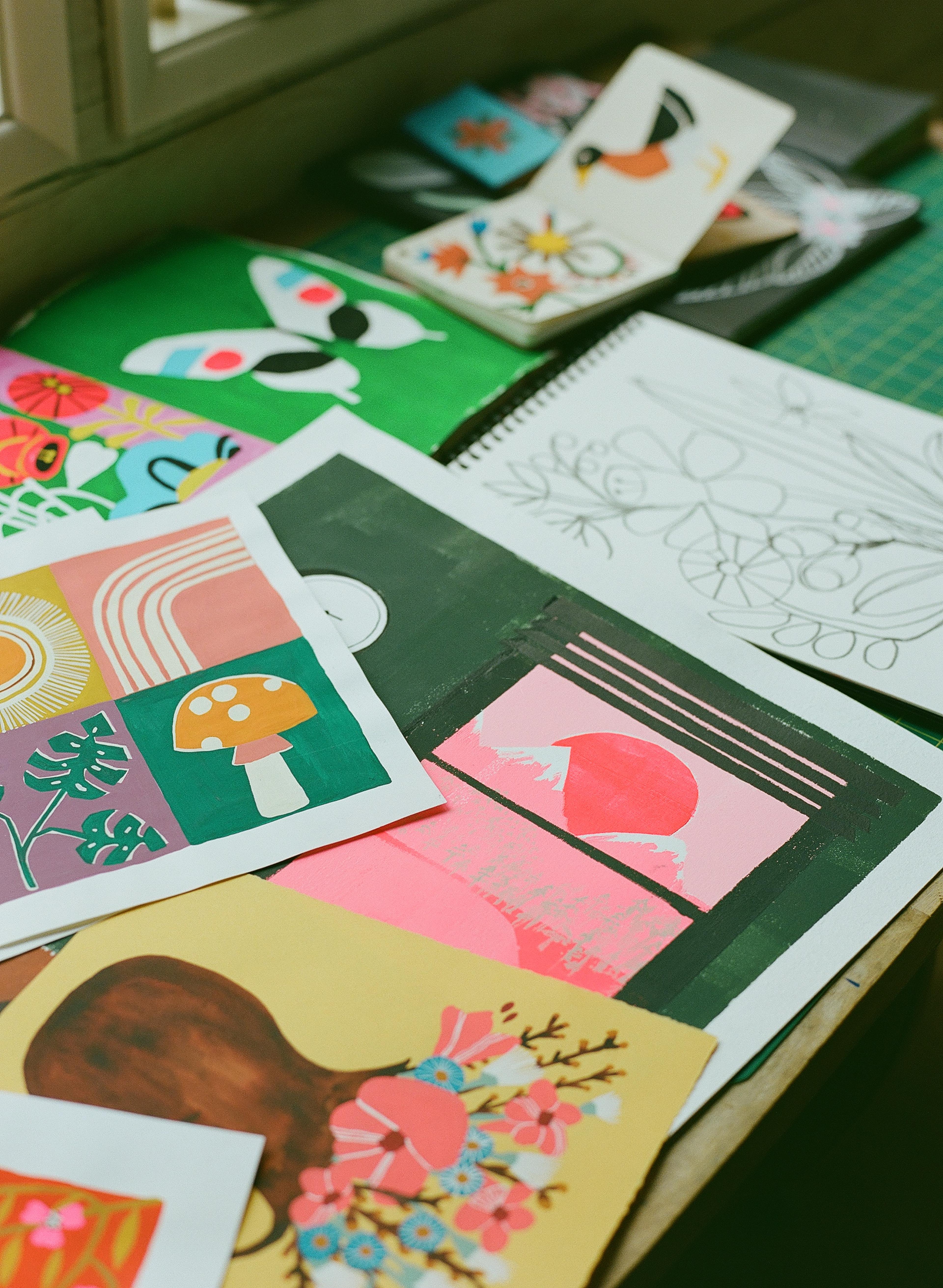
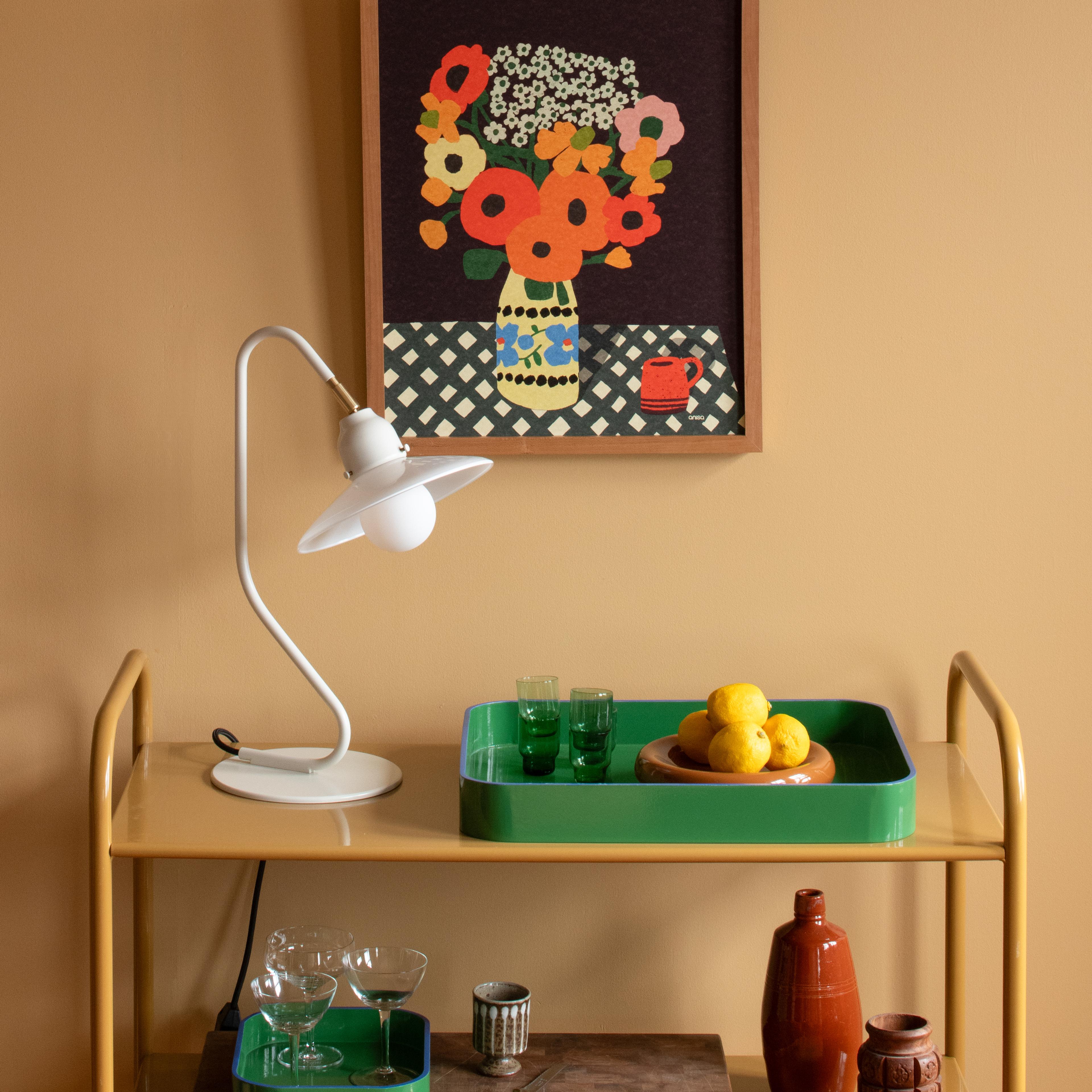
Rooted in the beauty of nature, Anisa Makhoul’s work reflects the whimsy and wonder found in life’s small, imperfect moments. Her floral pieces, crafted with a warm, earthy palette and bold contrasts, aim to evoke joy, energy, and a sense of quiet harmony. Through thoughtful simplification, she captures the essence of nature’s irregularities, turning them into art that speaks to the heart.
To explore more about her creative journey, process, and what inspires her to blend abstraction with nature’s truth, we sat down with Anisa for a closer look at the story behind her stunning work.
First off, can you tell us a little bit about your background with art and what led you to pursue it?
I’ve always been drawn to the arts. I studied Printmaking and Media Arts in college, then went on to start a clothing company. I worked in fashion for many years until I had my son. It was the silly drawings we did together at the kitchen table that got me hooked on illustration.
I took a few online courses and almost instantly began working in the illustration field, doing things like editorial work and fabric design. It felt like I had finally found the thing I was meant to do in my 40s.
Can you walk us through your creative process for creating the prints for this collection? How did you develop the composition and color palette?
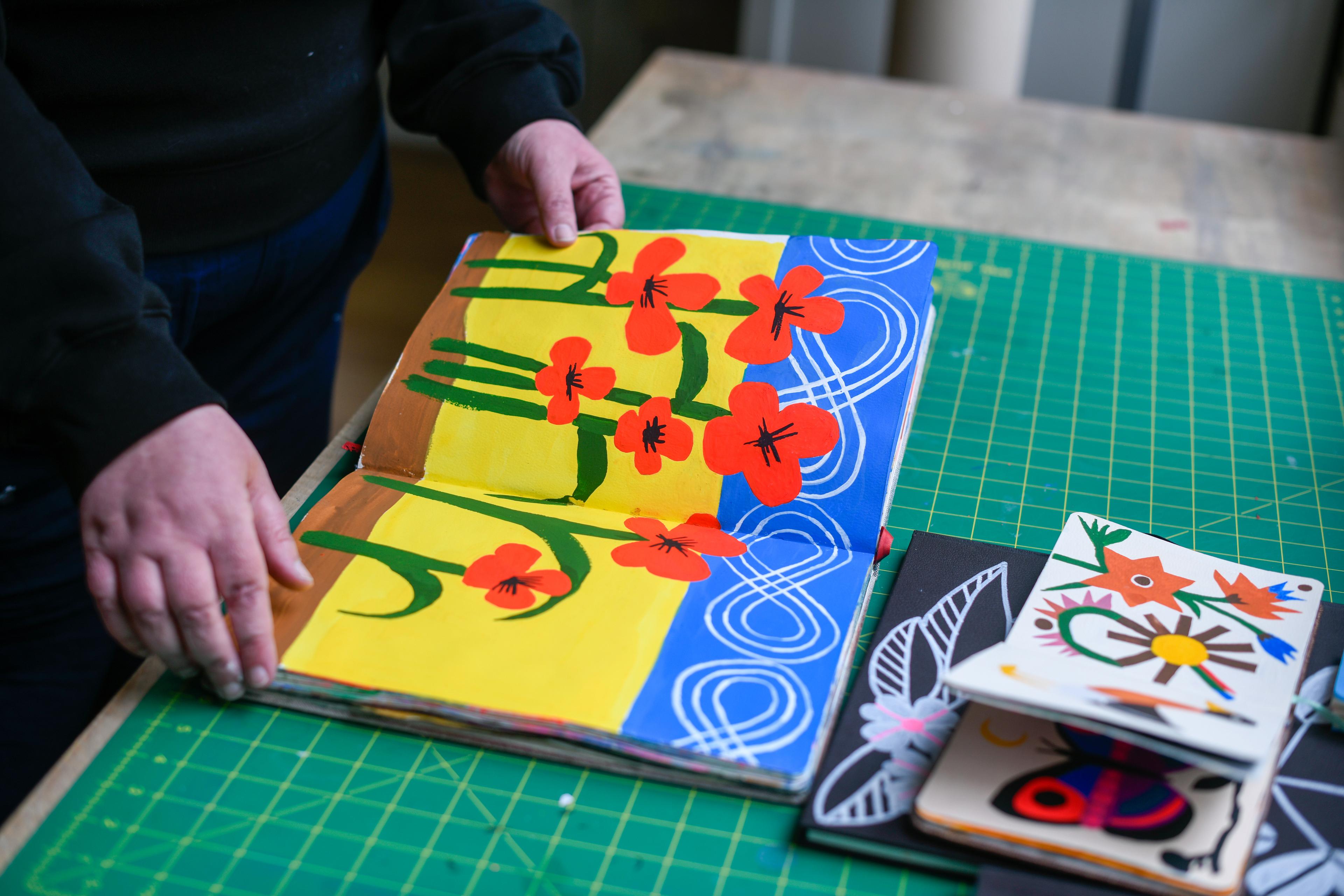
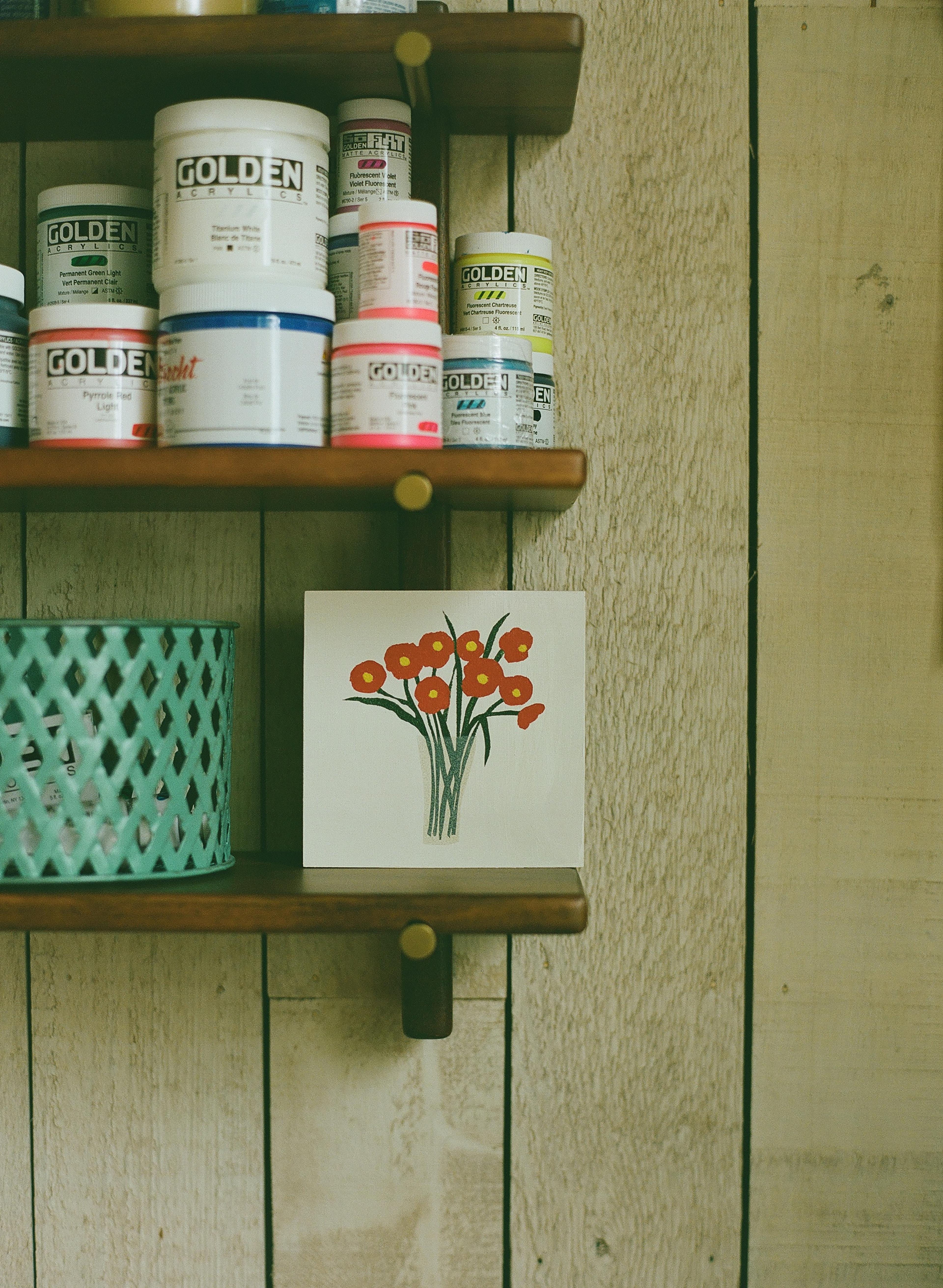
I wanted to include as much color as possible, but also keep it warm and cozy, so I leaned towards earth tones and vintage yellows. My creative process begins with lots of sketches of actual flowers—though they’re quite busy and not so great. From there, I simplify, reducing it to a few flower shapes that can repeat.
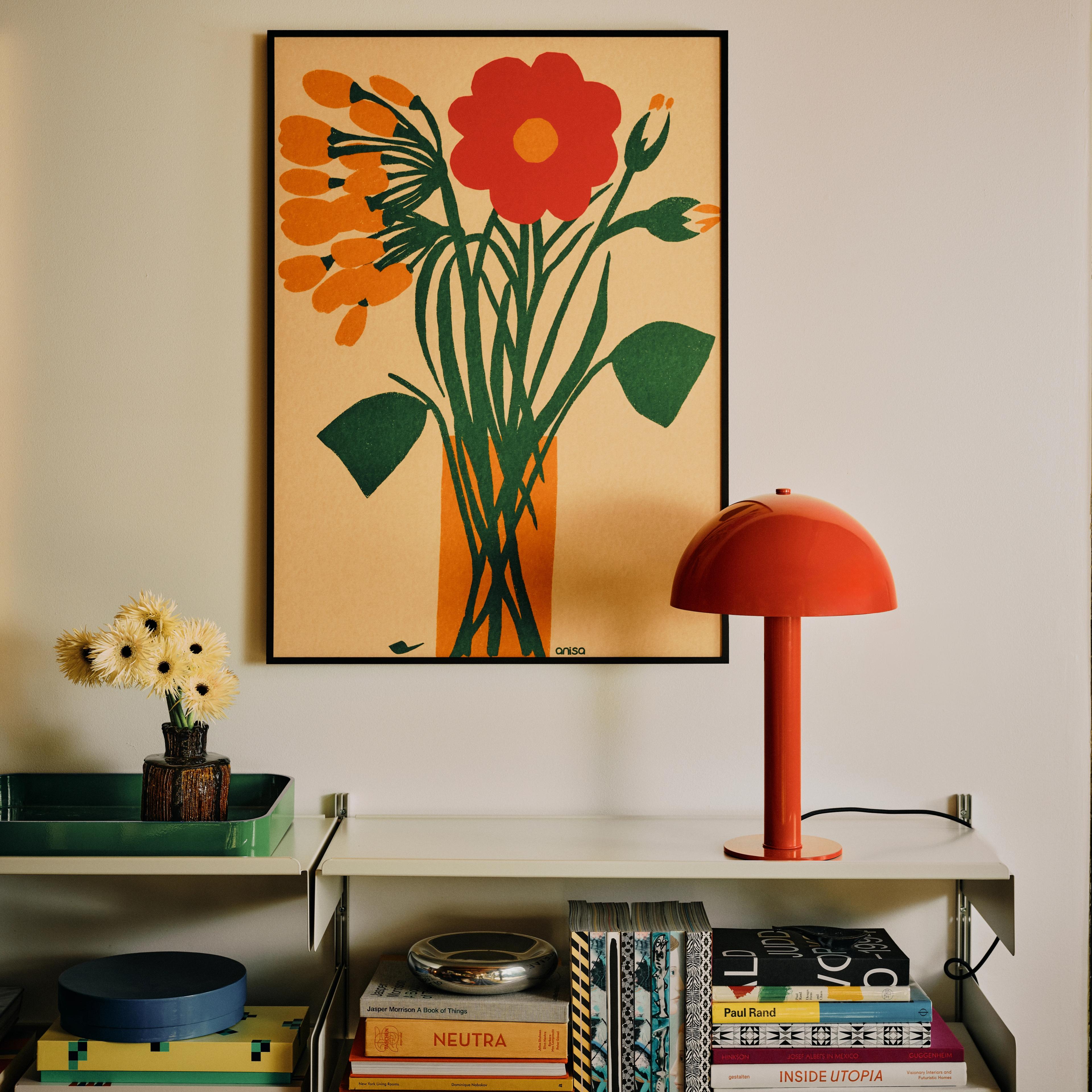


What was your inspiration behind the bold color choices and the contrasting backgrounds?
I set out to disrupt the ordinary by introducing vibrant, unexpected hues that command attention and evoke emotion. The contrasting backgrounds serve as a deliberate juxtaposition.
How do you feel nature and its elements, like flowers, influence your work as a whole?
Nature is a constant source of inspiration for me, not just in its beauty but in its playful imperfections. I love the unexpected quirks, like a branch twisting in defiance of symmetry, or a flower blooming just slightly off-kilter. There’s humor and spontaneity in those moments, like nature itself is quietly breaking the rules. When I bring those organic irregularities into my work, whether through a deliberately wonky line, an offbeat composition, or an unbalanced shape, it adds a sense of whimsy and life. It helps to convey authenticity, which is important to me.


How do you balance abstraction with realism in your floral pieces?
I love this quote by Georgia O’Keeffe: “Nothing is less real than realism. Details are confusing. It is only by selection, by elimination, by emphasis that we get to the real meaning of things.” Omitting unnecessary details is the essence of this.
The prints have such a fresh, organic feel. What do you hope viewers experience when they see your art in their homes?
I want my art to feel like that little jolt of dopamine you get when you walk into a room and everything just clicks—the cherry on top of your design. It’s not about filling a blank wall; it’s about adding energy, sparking joy, or even creating a moment of quiet to reset.